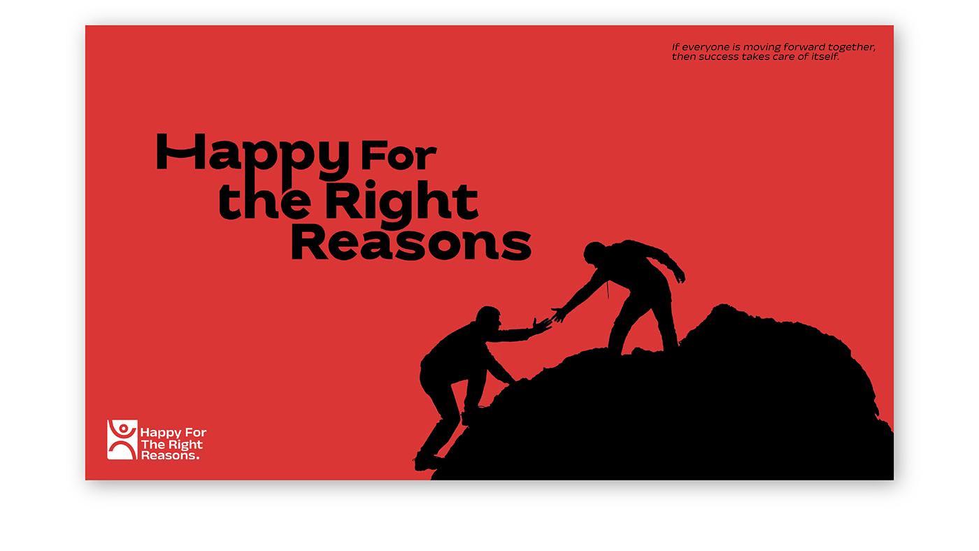
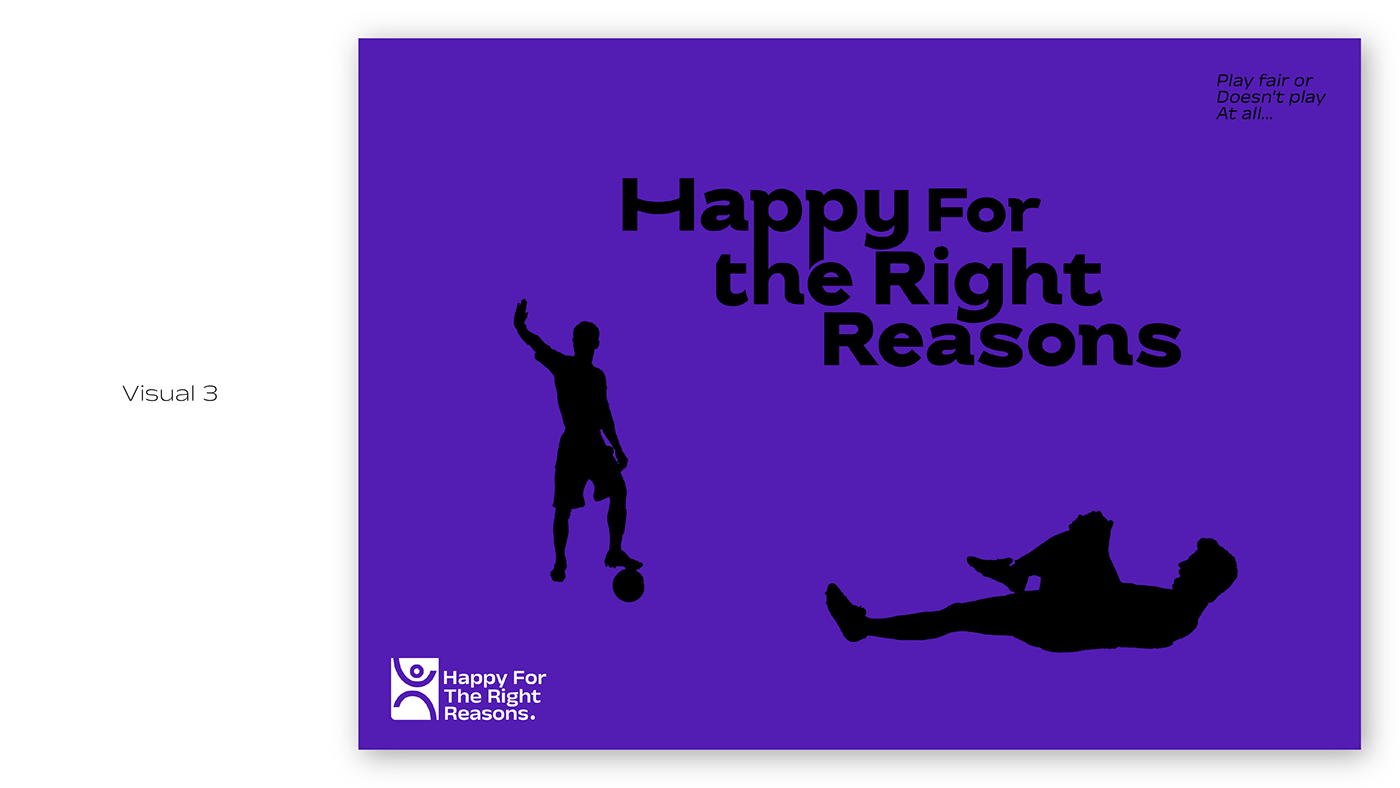
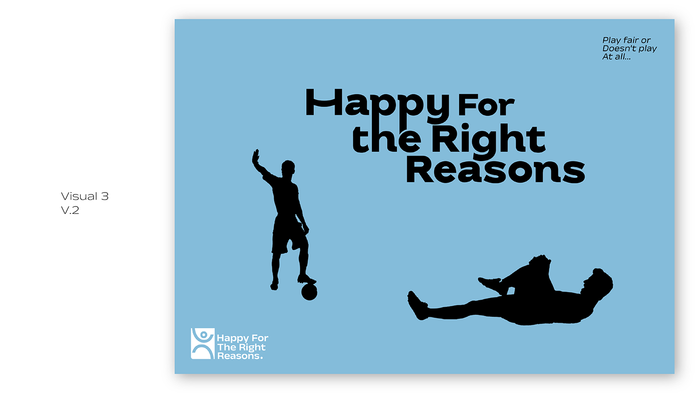
Created the logo icon simple, straightforward, and easy to recognize when I highlighted it with a composition that makes the logo more catchy, easy to see, and rememberable


Chosen a bright color palette to reflect the concept of “Happy For The Right Reasons” Which helps the logo to be more attractive, and rememberable.